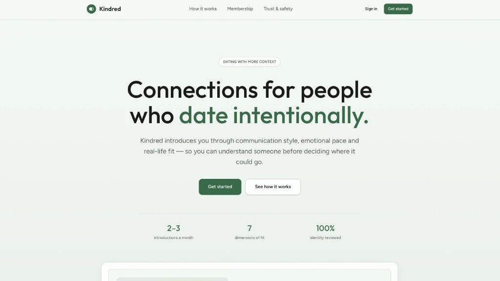
Dating with more context
Kindred
An intentional dating product — curated introductions, multi-dimensional fit, and identity review — designed for people who want connection without the swipe treadmill.
Product design · Trust & safety · Membership · Curated match
The problem
What this product was built to fix.
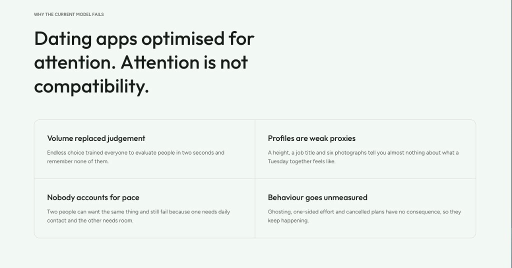
- 01
Volume over intention
Most dating apps optimize for endless swipes. People who date intentionally get noise, not context — and the brand rarely signals care before signup.
- 02
Trust as an afterthought
Identity, safety, and membership mechanics often live in footer links. Kindred puts trust & safety next to how it works and membership as first-class navigation.
- 03
Product and promise diverge
Loud dating marketing rarely matches calm product mechanics. The landing has to feel like the experience — quiet confidence, not growth hacks.
What it does
Surfaces that carry the product story.
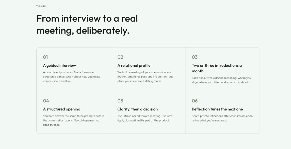
Curated introductions
A handful of introductions each month — designed for depth, not a firehose of matches.
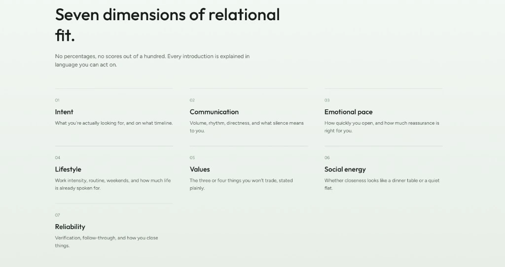
Seven dimensions of fit
Matchmaking that accounts for communication style, emotional pace, and more than a photo grid.
Identity reviewed
100% identity review as a product promise — trust baked into the headline stats, not buried in policy.
Membership & guidance
How it works, membership, and trust & safety as primary surfaces so the journey is clear before Get started.
How it’s built
Engineering and design decisions that make it real.
One calm composition
Soft sage atmosphere, forest-green CTAs, and typography that feels considered — brand and product mechanics read as one page.
Hero budget discipline
Brand, headline, one supporting line, CTAs, then proof stats — no clutter competing with intentional dating as the idea.
Trust in the chrome
Nav and stats make identity review and fit dimensions visible immediately, so skepticism is answered before the form.
Quiet motion
Presence without noise — enough motion for hierarchy, never enough to feel like a swipe casino.
See it live
Open the published product when the link is ready — or start a project with us in the meantime.
Want something at this level?
Tell us what you are building — we will shape the path with you.